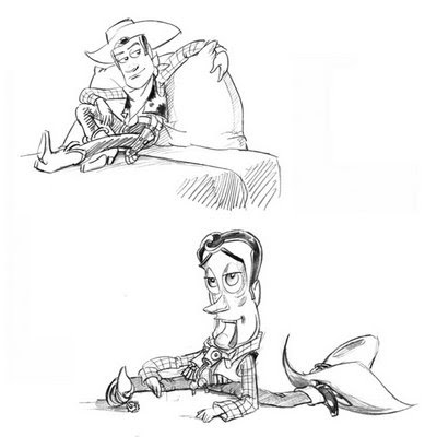
Last week we had a brief look at charater design and good designs of characters, so I decided to look at this in further detail through the varying aspects, as I will soon be starting to create my own characters for the pre-production project.
The first thing we have to think about in creating characters is their appeal. Appealing characters are those that are interesting to look at; (not being cute and cuddly 'cause what about the bad guys..) which is why in most good animated films, the main characters captivate us. We have the appealing 'negative' characters and the appealing 'positive' characters: negative being the 'bad guys' and positive being the 'good guys.' In order to create an appealing character it must have an interesting design - one that will hold us throughout the length of the film, but it mustn't be so complex a design as to deter the audience from that character, or from an animators point of view, unable to perform certain actions.
Following on from this we have the function of the character and the actions from the script or story that it's required to do. The easiest example of this is having one character hug another, where the character giving the hug must have arms long enough to reach around the body of the character recieving the hug. This is one such reason that when in a production studio that the characters should all be designed together before being finally produced so as no charaters seem 'out of place' or too big or small next to the others.
Another aspect to consider when designing a character, is to focus on it's silhouette. For example i've designed an everyday clown so from it's silhouette it should be easily read that it is a clown. To test the design further, we look at the character in action during various different poses so if we black it out we should easily tell the kind of action or emotion just from looking at a silhouette.
In addition to silhouette there are the general shapes that make up characters such as the square, circle and triangle and their underlying meanings. Circular characters, for example, are seen as the non-threatening, trusting or innocent ones. Squarely shaped characters are those that are seen as solid, dependable or strong; and triangular characters are often portrayed as aggresive, insightful or quick personalities. These basic shapes can be mixed around and made extremely interesting when you take these shapes and mix them up with different personalities to get a completely new take and approach to design.
One more thing to keep in mind is to design the characters in the same style i.e. from the same created universe sharing the same context throughout the characters, backgrounds and props. This could be a number of things from the simple, taking a vase design from the ancient greeks and applying the same design throughout; or it could be keeping the similar shape of the bodies, heads, eyes, even a colour scheme or even something down to a rendering style.
I then went out and found some characters that I like and think are appealing. For example I think Nick Park's creations Wallace and Gromit and others are well designed charaters that also work well in action. Notice how there is a part of them that makes them live in harmony in the same world: the eyes.


All these key factors as mentioned above, are things I shall keep in mind when designing my own characters for this and future projects.
No comments:
Post a Comment