Wednesday 17 February 2010

Extra, Extra

Here are the additional extras to this Doctor Who script, the first Reinette aka Madame de Pompadour and the others, the droids with variations on their clothes and the masks (that they will wear over the head, to hide the clockwork mechanics)

Reinette: Madame de Pompadour Turnaround

Droids: Outfit Variations

Droids: Mask Variations

"My name is The Doctor, last of the Time Lords..."

Here is some of the design work for Doctor Who, initial sketches and final poses.

The Doctor Development: Start to End

Pose and Head Turnarounds

Costume close to Final Design

Pose Variations

First Quick Sketches looking at the Head Shape

Final Doctor from behind

The Doctor Final: Poses

Characters

Now we're at the character concepts and final designs stage. The image below shows, in a way, the process I used to create my characters. First I looked at concept art similar to the styles I want and then drew out body shapes familiarizing myself with the shape of how the character will look and with each drawing it became easier and slightly quicker each time. After this I then started drawing various poses and changed the clothes with each one and then I settled on a design that best portrayed how I want the characters to look. Below is some of the work done in order to get to the final stage. As extra help, to make sure I get the head right whichever way I turn it I also made a 3-d clay model, which when my camera works I'll put up a few images.

Character Development: Start to End

Body Shapes

Variation Poses and Costumes

Rose Pose

Clothes Variation

Final Rose

Final Rose: Poses

Wednesday 10 February 2010

Character Design Styles

Okay, so now we're onto the character designing aspect and I wonder where to start. Well as with everything I do, a spot of browsing was in order so I sifted through loads of concept art from games, films and just generally to gather a good idea of the various styles that are out there. From the styles I liked and found quickly on the internet, mainly from deviantArt, I made a Character Design Styles image board from the ones I liked. Nearly all of the drawings on here take the human form, simplify it and accentuate certain features to stand out and make that character unique and aesthetically pleasing, and hopefully I will be able to create this style of character.

Tuesday 9 February 2010

... annnd the winner is ...

As well as looking further into The Girl in the Fireplace script, I delved a bit deeper into the Voyage of the Damned script, so here I have the extra image boards of research for the ocean liner setting. Here I've looked in more detail at props and also at the costume, looking into the 1910-1920's era.


Ocean Liner Props

Here I looked into props a bit more, focusing on the scene where the doctor walks around the reception room, so I looked at the waiters and the kinds of food and drink that would be sitting on tables and handed out: champagne, sandwiches, cheese and pineapple sticks, fruit bowls and scones.

Below is the research board for costume for women and the sort of style I'd want if I were to go with this script. I looked at the late 1900, 1910 to 1920's era of clothing and during the late 1900 to early 1910's I found that the wealthiest women wore bigger hats than those who were less well off, more like a statement of how rich you were by the size of your hat. As such 1910-1919 is characterized by a rich and exotic opulence up until the first world war in contrast to the plain practicality of garments in the late 1910's. The 1900's had long flowing dresses that covered, most of the time, all areas of the body, making as curvy as possible the silhouette of the female form. During the 1910's dresses had raised up to well above ankle height and arms were starting to be shown in the mid to later years.The 1920's however was the decade when women began to liberate themselves from constricting fashions and began to wear more comfortable clothes. Men likewise abandoned overly formal clothes and began to wear sport clothes for the first time. The suits that men wear today are still based, for the most part, on those which were worn by men in the late 1920s. In the early 20's womens' clothes changed slowly and many were still reluctant to adopt the new style. However the styles of the mid to late 20's became embraced as they were associated with the styles of the Roaring Twenties, those styles that would still be characterizing fashions into the early 1930's.


Ocean Liner Costume

After researching this script in more detail I did find that this script hadn't enthused me as much as The Girl in the Fireplace script did. However though, I do like the whole costume aspect of this script and the possibilities of the ships design in space, and the landscapes of space that can be created. Ultimately though I have decided on the Louis XV setting to produce my Pre-production bible for, as I think I will find more enjoyment in designing most aspects of this script, especially the costume. Furthermore, since the costume and props of Versailles are set in one time and not with possibilities of future elements, I hopefully wont be spending too much time on designing the elements.

Saturday 6 February 2010

Time for the decider ...

Now, I've become stuck on two scripts. Voyage of the Damned (1910-20's ocean liner setting) and The Girl in the Fireplace (Louis XV setting) and so by the process of elimination through the aspects I'd like to do ... I'm still stuck. So below I have a few images of a bit more design research delving further into more detail of the Louis XV period.

Louis XV Costume research

Researching the costumes for this period was quite interesting and there were many explanations and images for the womens' clothes, however it was tricky to find a good amount of images for the mens' clothes. Women wore quite a range on the types of clothes in the 18th century, which were: the polonaise, the circassiene, the caraco, the pelisse and odd bits from the Redingote and the Levite. The polonaise, originally robe à la Polonaise, consists of a gown with a fitted bodice and cutaway, draped and poufed overskirt, worn over an underskirt or petticoat, I think this also may be a couple of years later than the period in the script but I can take inspiration from these images. The circassiene, or robe à la circassiene, is a variation of the polonaise: short funnel sleeves, through which fitted sleeves of the undergarment are drawn through. The caraco is a hip-length robe worn over skirt (usually contrasting) with flounced hem. There are also variations of the caraco such as, caraco a coqueluchon that has a hood as well, and the caraco a la francaise that has a robe with loose pleats at the back. The pelisse is an extra that is worn ontop, it's a padded cloak or coat worn for warmth. The redingote is more of an English inspired dress as it's a gown patterned after English riding coats. The Levite is a gown that's sleeveless or short-sleeved, straight in style and sashed at waist.

As well as their costume there were many variations of wearing the hair in the Louis XV period: the coiffeur à la dauphine where the hair is gathered up and rolled into curls that fall on the neck; the coiffeur à la monte au ciel that had extreme height; the coiffeur loge d'opera that is more like a show piece divided into several zones and completed with three large feathers attatched on the left temple, with a bow of rose coloured ribbon and a large ruby (gaining as much height as 72inches from the chin to the top of the hair); the coiffeur à la queasco, which is the same as before but the three feathers are placed at the back of the head. The real showpiece on the head is the pouf coiffeur that has a huge composition of feathers, jewellry, ribbons and pins, butterflies, birds, painted cupids, branches, fruits and vegetables. Imagine carrying that around with you.

Louis XV Props research

The props research board is just as ornate and detailed as the costume research. All furniture was made to a very high standard and with plenty of gilded detail as a show of the higher class, and all of which, produced in a strong Rococo style. The Rococo style is found in architecture, interior design, decorative arts, painting and sculpture that originated in Paris in the early 18th century but soon spread across all of France and into other countries, most notably Germany and Austria. Rococo is characterized elegance, and a surplus of curving and natural forms in ornamentation such as flowers and plants. During the reign of Louis XV there were an enormous number of homes owned by royalty and nobility and the makers of furniture and designs produced exquisite and plentiful items for these homes.

Friday 5 February 2010

Initial Concepts

As mentioned in an earlier post I had started to look deeper into initial design and research, and started to create my own concepts of the scripts, as to how I'd want them to look, based on the images I found. In addition to this, since then, I have story boarded scenes from the two scripts I like more, the ocean liner and the Louis XV script, and one of these I think I will end up producing the pre-production bible for.

Ocean Liner Props


Chino-Planet Props

Chino-Planet Props

Here is the opening scene for The Girl in the Fireplace that I've quickly story boarded to get a good feel for what needs to be seen background and props wise if I were to design this script.

Storyboard 1

Storyboard 2

Storyboard 3

Wednesday 3 February 2010

Character Design-ign-igning

A couple of weeks ago we had a lecture on storyboarding, which I found really quite insightful into the art of drawing a story and the various ways of interpreting the written scripts. As well as producing a storyboard in such a way that creates the right impact on the the audience at that specific time: whether it's to create tension, empathy, sadness ect.

Last week we had a brief look at charater design and good designs of characters, so I decided to look at this in further detail through the varying aspects, as I will soon be starting to create my own characters for the pre-production project.

The first thing we have to think about in creating characters is their appeal. Appealing characters are those that are interesting to look at; (not being cute and cuddly 'cause what about the bad guys..) which is why in most good animated films, the main characters captivate us. We have the appealing 'negative' characters and the appealing 'positive' characters: negative being the 'bad guys' and positive being the 'good guys.' In order to create an appealing character it must have an interesting design - one that will hold us throughout the length of the film, but it mustn't be so complex a design as to deter the audience from that character, or from an animators point of view, unable to perform certain actions.

Following on from this we have the function of the character and the actions from the script or story that it's required to do. The easiest example of this is having one character hug another, where the character giving the hug must have arms long enough to reach around the body of the character recieving the hug. This is one such reason that when in a production studio that the characters should all be designed together before being finally produced so as no charaters seem 'out of place' or too big or small next to the others.

Another aspect to consider when designing a character, is to focus on it's silhouette. For example i've designed an everyday clown so from it's silhouette it should be easily read that it is a clown. To test the design further, we look at the character in action during various different poses so if we black it out we should easily tell the kind of action or emotion just from looking at a silhouette.

In addition to silhouette there are the general shapes that make up characters such as the square, circle and triangle and their underlying meanings. Circular characters, for example, are seen as the non-threatening, trusting or innocent ones. Squarely shaped characters are those that are seen as solid, dependable or strong; and triangular characters are often portrayed as aggresive, insightful or quick personalities. These basic shapes can be mixed around and made extremely interesting when you take these shapes and mix them up with different personalities to get a completely new take and approach to design.

One more thing to keep in mind is to design the characters in the same style i.e. from the same created universe sharing the same context throughout the characters, backgrounds and props. This could be a number of things from the simple, taking a vase design from the ancient greeks and applying the same design throughout; or it could be keeping the similar shape of the bodies, heads, eyes, even a colour scheme or even something down to a rendering style.

I then went out and found some characters that I like and think are appealing. For example I think Nick Park's creations Wallace and Gromit and others are well designed charaters that also work well in action. Notice how there is a part of them that makes them live in harmony in the same world: the eyes.

http://www.stopmotioncentral.com/images/Wallace_and_gromit.jpg

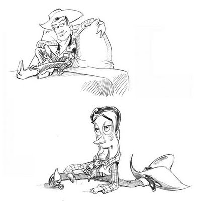
I've also found a few examples as shown below of Woody and Buzz Lightyear, some of the most memorable characters from Pixar studios. They're both so simply designed: Woody, the average cowboy with a cow-skin waistcoat, sheriff badge, jeans, checkered shirt and boots and spurs; and Buzz a simply designed spaceman with gadgets and buttons. These two as well as being designed well, work well as animated characters. And notice how in a final render shot, the parts of the characters that are the same is the eye area.

https://blogger.googleusercontent.com/img/b/R29vZ2xl/AVvXsEgTLWdqVLN7_KqoUcvElMVnjVeQhhptcPHz5cRuESsjnlqLgrKNqI04_VEzSMeQUr7UoWT39Zv9OUvlfj5C2q2p-CIDYR95AT6xJrmHDWPweTanTh4RBQbaOMbxLj03IB-rWFttfaswtkaO/s400/Woody.jpghttp://www.cgexplorer.com/_sys/wp/wp-content/uploads/2006/02/buzz-lightyear-drawing-pixar.jpg

http://i31.tinypic.com/2zsvblt.jpg

All these key factors as mentioned above, are things I shall keep in mind when designing my own characters for this and future projects.

The Story So Far ...

Here I have the rest of the research boards for the initial research into the five scripts for my parts. The first two images are those of the research for the ocean liner, the first props, and the second architecture. As with my approach to all of this initial research, I got a general and wide overview of the kind of items and artifacts that would be found on the ship; mainly for the scene where the doctor walks around the main hall, getting a good feel for where he is. Firstly there would be waiters and waitresses serving champagne and/or wine and whiskey, so I looked into various shapes of glasses. Then there's the lights so I searched around for 1910/1920's lamps for tables and floor, as well as looking into crystal chandeliers, which are usually found on ships of grandeur as a show of status. In addition to this there are bits of furniture like small end tables for the lamps and waiters trays, and small dining tables and chairs. There will also be odd bits of ornaments and showy items such as globes and fanciful flower arrangements.

The Ocean liner Props

Below is the research for the architecture for the ocean liner. For this, which as I mentioned before, was quite tricky to acquire images for. The colour images were from a fairly new ship the Queen Mary, which is a sort of similar style to that of the Titanic but it's not as showy. Some of the others are from old black and white photographs of what the Titanic looked like during and before sail. For the rest of the images I also researched into home interiors from the 1910/1920's to get a feel for the environments people lived in and were used to at this time, and some elements will have been taken straight into the ocean liner such as the ceiling decoration and the detail in and around the fireplaces.

The ocean liner Architecture

The next board is for the landscapes of Shakespearian London. This wasn't tricky as such, but research into this was limited, because as I had finished reading through the script there weren't really many instances that called for landscapes to be thought up. There was the view of Shakespeare's Globe Theater looking up into the sky during the day and night. For the day scenes I looked at blue skies dotted with a few clouds, and for the night scene, which is where the witches have used the words at the end of Shakespeare's 'lost script' to summon the rest of their kin; I looked at the Aurora Borealis as it has magical and unearthly qualities to it creating different swirls and curls. For the general scenes where we see an overview of London looking out onto the river and it's bridge, I researched into what the bridges had looked like at that time and found that there were many houses on them and another place for people to live as well as getting from one side to the other. I then looked at night skies which would have been black and clearly being able to see the stars (hard to imagine given current-day cities) with buildings dotted with small yellowy lights from the candles. I also looked at sunrises which also appear in one scene.

1599 London Landscapes

The two images below are those for the Louis XV script initial research: costume and architecture. For architecture I decided to go for a general view on the palace and not limit myself to early on, on just one part of the script; for example just looking at the interior of her bedroom. I especially liked researching this period of time as I love the costume design of the womens' dresses and the attention to a huge amount of detail in the architecture and with everything during that time. In order to research the clothes I looked into paintings of French king's and queens from that and around that period as well as period dramas such as Marie Antoinette.

Louis XV Costumes

The next image is that of the architecture research for the Palace of Versailles. Searching for these in books and on the internet blew me away as they're just amazing, there is so much detail in all the walls and ceilings. The Palace of Versailles, I would say is a mix of baroque and neoclassical architecture; it's features of linear pillars and some simple elements of build lend itself to neoclassicism, while the attention to small details and grand size lend itself to the baroque element of architecture. I looked at the relevant books with one Neoclassicism and Romanticism Architecture which had pictures of Versailles halls and detail, I also took images from other great halls which could also be implemented into the palace. The rest of the images, the front of Versailles, the view from the garden, and a few interiors and the detail of the statues in the hallway I found on the internet.

Louis XV Architecture

The final image board is the costumes I researched for the Pompeii script. This was another difficult area to research as there isn't really any physical sources of clothes they wore. I looked into Pompeii clothes and togas and not many images came up, so I then looked into Roman clothes and togas. A few more images came up on the internet but nothing to base any designs on. So I then thought about the items that will have survived like paintings and statues, and then I looked around for these images to get a good feel for the clothes they wore; searching wall paintings in Pompeii in homes and also Roman statues.

Pompeii Costumes

I really enjoyed researching the various areas of the scripts, costume, architecture, props and landscapes, and look forward to delving into even more research on the script I will be focusing on.