Okay so while in the process of finalizing my drawn idea I've started by creating the elements I know are a definite to this experimental project. So far I've knocked out a few different mushrooms, getting an idea for how vines will look and the cliff. I also made an extra mushroom because I forgot about taking screen grabs, so it's all good now. Below you'll find my progress on making the mushroom and the vines. I'll make little noters about the process I used behind it, as I'm not 100% on what the walk-through will be yet.
I started off with a cube and gave it a height of 2 segments. From that I scaled out the bottom edges, extruded a face on the top and scaled it inwards, creating a boxy hemisphere. (Yep, it took me ages to figure out what a 3D semicircle was called ...)
 I then put some edge loops in so that I could give it a more circular shape, then flipped to the underside and started to roughly extrude and scale the faces to create the stem. I then clicked these edges around the stem to pull and scale and pop them into the final place:
 Next I split the faces on the mushroom cap, so I could get a better shape to it and match it up with my drawings. I used the split poly tool for this as the edge loop tool would have circled itself around the entire mushroom, and having too many polygons on the stem is just unnecessary.
 I then pulled and scaled the edges around around until I had the basic shape, and from there I tweaked with the vertices until I was satisfied I got the right shape:
 Below I started to tweak the top part of the stem and get more of a curve into it, like I had in my drawings, so it starts to flow a bit more:
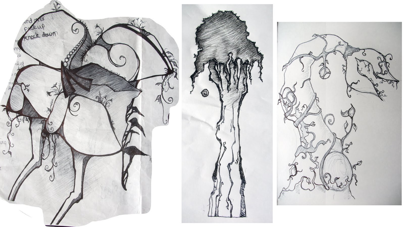
 The lower part of the stem looks a little thin in comparison to the top part, and doesn't give much of a sense that it would work. It feels like it would snap. So I shall concentrate more on designing and exploring the base and lower stem of the mushrooms, since it must hold all that weight up and have some sense of the real to it.
The next part is the vines. Now I knew there was I way to create polygons with a curve, but not as I was thinking with the loft and other tools in maya, and surprisingly enough I found a video to give me the step I needed from none other than Digital Tutors on youtube. Well at least I learnt something off it anyway. I went and created my CV curve and then edited the points to the right shape I wanted.
 Then I made a small cylinder with the right diameter for the base of the base and placed it at the top of the curve. I deleted the unnecessary edges on the bottom and selected the face, then the curve and extruded (with many segments not just the default 1). In the image below you can see in the second image, that the extrude is equal from top to bottom, and since the growth of vines usually becomes thinner at the tips so I played around with the taper control, made it thicker at the tip and in the last image thinner.
 I then pulled out the curve, and altered the mesh slightly since it's still connected to the extrude control. I played around with the points and vertices to create some funky results, but for now I've stuck to the smooth curves. Until putting all the elements together I won't know for sure if I want to keep that flowyness to them, and I have feeling I'll lean more towards the tests below, to create something more natural, and more stylised in the process.
 Below, I repeated the same steps to create these 3 interlinking vines:

I quite like the way they've turned out, but I feel that the vines need more in-depth study on paper as quick sketches and scribbles can only give me a limited inclination as to the shape and composition as to how they should look and I felt I spent more time tweaking the vines and thinking about how to make them work together, than taking the composition from paper and doing slight tweaks to match it up.
 Then I made a small cylinder with the right diameter for the base of the base and placed it at the top of the curve. I deleted the unnecessary edges on the bottom and selected the face, then the curve and extruded (with many segments not just the default 1). In the image below you can see in the second image, that the extrude is equal from top to bottom, and since the growth of vines usually becomes thinner at the tips so I played around with the taper control, made it thicker at the tip and in the last image thinner.
 I then pulled out the curve, and altered the mesh slightly since it's still connected to the extrude control. I played around with the points and vertices to create some funky results, but for now I've stuck to the smooth curves. Until putting all the elements together I won't know for sure if I want to keep that flowyness to them, and I have feeling I'll lean more towards the tests below, to create something more natural, and more stylised in the process.
 Below, I repeated the same steps to create these 3 interlinking vines:
I quite like the way they've turned out, but I feel that the vines need more in-depth study on paper as quick sketches and scribbles can only give me a limited inclination as to the shape and composition as to how they should look and I felt I spent more time tweaking the vines and thinking about how to make them work together, than taking the composition from paper and doing slight tweaks to match it up.